Deleted
Deleted Member
Posts: 0
|
Post by Deleted on Aug 30, 2015 9:19:40 GMT -5
This forum seemed the most appropriate place to place this thread, although it is not a screenshot yet. I am in the process of creating a fictional BOAC repaint of the Manfred Jahn Super Constellation. I am not an expert repainter, but it is looking quite well. I can copy the BOAC lettering in from repaints of other aircraft by other painters, but would prefer not to do this if it can be avoided. In this context, does anyone know what font was used, as internet searches have not managed to produce this information?
Ken
|
|
|
|
Post by Tom/CalClassic on Aug 30, 2015 9:42:12 GMT -5
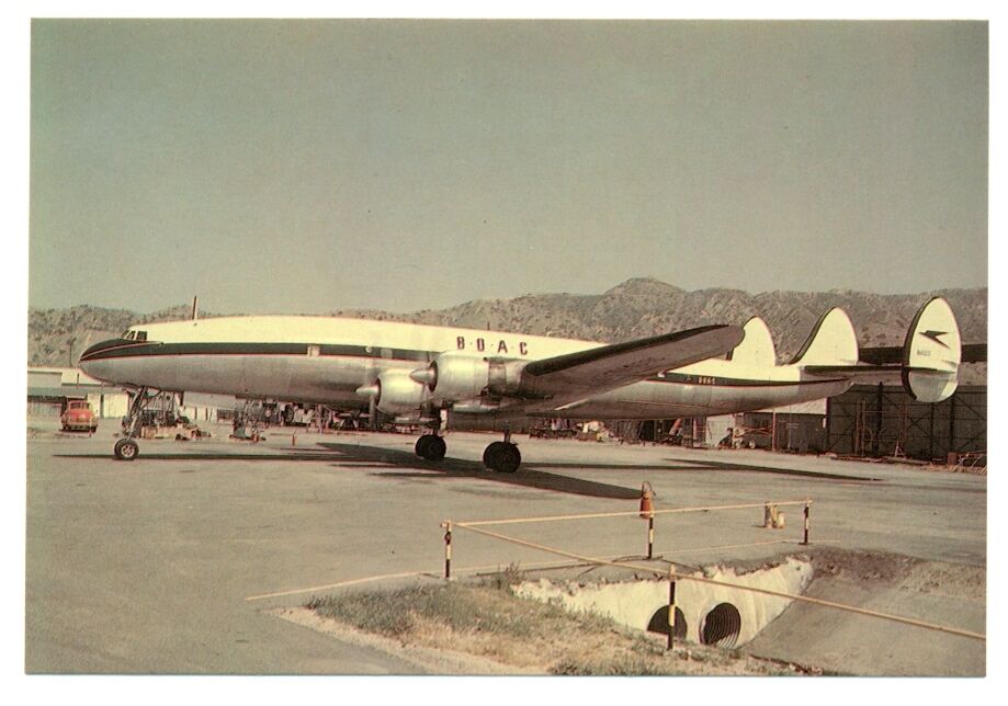
Why fictional? They leased at least one Super Connie:  I don't know what font that is - when I did it I used a sans-serif font, smashed it so it was very narrow, and then cut off the ends of the letters to make those abbreviated shapes. Note that the letters on this plane are not exactly the same as most others - must have been painted elsewhere. |
|
Deleted
Deleted Member
Posts: 0
|
Post by Deleted on Aug 30, 2015 11:27:24 GMT -5
Many thanks for this, Tom. The Super Constellation is not listed as one of the types they operated by Wikipedia - the source of my knowledge of many things - clearly wrongly. This complicates things, because I had taken liberties with what I knew to be the likely colour scheme in order to make things easier. I'm not sure I can do a fuselage stripe as wavy as this, but we shall see. According to the link I give below 'From the summer of 1955 to the spring of 1956 the British Overseas Airways Corporation (BOAC) leased three of Seaboards' L-1049D aircraft for passenger operations.' The one in the photograph is presumably one of them. Is there any information on where it was taken please? The main timetable site I use does not have a BOAC timetable for the period concerned, otherwise it might be possible to find out a little more. As Manfred's aircraft is a 1049G the paint would still technically be fictional, but fortunately nothing like as fictional as it was! Ken tweedlandthegentlemansclub.blogspot.co.uk/2012/10/those-were-days-lockheed-l-1049-super.html |
|
Deleted
Deleted Member
Posts: 0
|
Post by Deleted on Aug 30, 2015 11:38:09 GMT -5
And according to this site on Seaboard, with a goodish colour photograph of a BOAC Super Connie, 'In the meantime Seaboard started to lease out their Super Connies: The first arrangement was with BOAC (April 1955 - April 1956), which operated two Super Connies on the New York - Bermuda route'. Edit. I guess it was painted in the U.S.A. and the lettering looks different because they didn't have the right font either. www.zoggavia.com/Seaboard___Western.html |
|
|
|
Post by Tom/CalClassic on Aug 30, 2015 13:18:34 GMT -5
|
|
Deleted
Deleted Member
Posts: 0
|
Post by Deleted on Aug 30, 2015 13:42:19 GMT -5
It certainly does, Tom, many thanks. According to one contributor in the forum they were also used for New York - Boston - Prestwick - London. Even better! And there is a photo of one at Stuttgart. Better still!
|
|
|
|
Post by Dennis the menace on Sept 1, 2015 15:32:28 GMT -5
Hi Here is some useful info for you: N1005C Lockheed L-1049E-55-115 c/n 4557 1956-1956 leased N6501C Lockheed L-1049D c/n 4163 1955-1955 leased N6503C Lockheed L-1049D c/n 4164 1954-1955 leased N6504C Lockheed L-1049D c/n 4165 1955-1956 leased www.aerobernie.bplaced.net/BOAC.htmlThese were leased from Seaboard and Western and went back to Seaboard and Western after BOAC. In early 1962 they went to Canadair, and in May 1962 they went to Capitol Air - after that they were scrapped. |
|
|
|
Post by deltalima on Sept 1, 2015 16:10:30 GMT -5
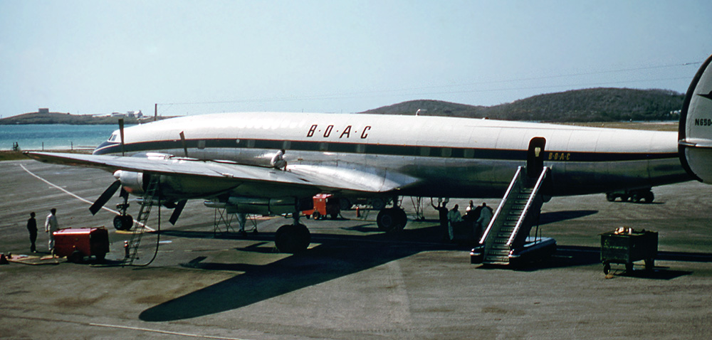
A nice shot of either N6501/3/4 ...  dl edit - looking at the tail again, I see a hint of a protrusion of the number next to the 0 - so logically, that'd make it N6504... |
|
|
|
Post by Defender on Sept 1, 2015 16:34:28 GMT -5
There's a note on the Seaboard website which suggests that N1005C was in demand because passengers weren't thrilled about the shortage of windows on the others  However they only kept it for a month. BOAC were indeed short of suitable aircraft at that time. Not unusual for British airlines it seems. One of my oddest flights was turning up at Heathrow in the '70's for a British Airways flight back to Glasgow and finding myself on a wet lease American Trans Air 727! Ken, Manfred's no radar/no tip tanks model will be completely accurate for what you want. Nothing virtual needed. Any conversions from 1049D to 1049H would just have been strengthening, most airlines retaining the original 3,250 bhp engines. Bill |
|
Deleted
Deleted Member
Posts: 0
|
Post by Deleted on Sept 2, 2015 4:22:10 GMT -5
Many thanks for all this information, and especially to Deltalima for the most recent and very informative photograph. My problem is that I have Photoshop and that its Pen tool is not the easiest of things to use to produce precise wavy lines. I have got a little further in the last few days by doing a horizontal one and then warping it, but this tends to result in jaggies. However, what is clear from the latest photo is that the fuselage stripe did not have the usual BOAC gold edging, which simplifies things. The other issue is then aligning the stripe on the fuselage with that on the nose. If anybody has any tips on this which go a little further than simple trial and error I would be grateful to have them. I intend persevering, because this would be an unusual paint of some rather unusual aircraft,
Ken
|
|
|
|
Post by Dennis the menace on Sept 2, 2015 10:29:47 GMT -5
However, what is clear from the latest photo is that the fuselage stripe did not have the usual BOAC gold edging, which simplifies things. Ken I just copied the photo and put it into Paint Shop Pro and enlarged it. It clearly has a gold line along the top of the blue. The color identifier says it most likely also has a gold/yellow line along the bottom of the blue although it is very difficult to see with the eye in the photo. When I create "wavy" lines I use Bezier Curve tool. When I am doing very thin lines like this I will do all the lines in separate layers and then merge the line layers into a single layer. For example: You would have your basic BOAC repaint on one layer. On the layer above that, you would have your blue stripe. On a layer above the blue stripe you would have your thin gold stripes. This allows you to move and modify these stripes to get them just right. Once you are satisfied with them, you can merge them into your BOAC layer. I would never use the "pen" or the "freeform" line tool for drawing anything, it is far to imprecise. In fact, in using PSP for over 10 years now, I don't recall ever having used those tools. |
|
Deleted
Deleted Member
Posts: 0
|
Post by Deleted on Sept 2, 2015 14:13:50 GMT -5
Thank you for the information on the gold lines, Mike, and for what you say about Bezier curves, which I will look into. Manfred's L1049H has rather more windows on the port side than the aircraft in Deltalima's photo, but it shouldn't be too difficult to do something about that,
Ken
|
|
Deleted
Deleted Member
Posts: 0
|
Post by Deleted on Sept 4, 2015 6:37:04 GMT -5
 BOAC Lockheed Super Constellation at the Cal Classic Beirut airport. As doing the paint of the authentic BOAC Super Constellation is going to take much more time, and as I do actually want to start flying the Super Connie fairly soon, I have created a purely fictional one to be getting on with. I am now able to produce smooth curved fuselage stripes with edging and find that Gill Sans MT Condensed, which is on my Windows 8.1 system, is a pretty usable font, although one site on the internet gives the BOAC font as Fanfare. However, the Fanfare fonts I have seen are nothing like what is required. When I have tested it I can make this paint available should anyone want it. The real G-ALHX was a Canadair Argonaut. Ken Attachments:
|
|
|
|
Post by Dennis the menace on Sept 6, 2015 13:48:23 GMT -5
It looks fine except it appears that the BOAC lettering might be a little high up from the blue cheatline compared to the photos of the real thing. It looks like the letters aren't placed that high up on the fuselage. Good job on bending that line, its not the easiest thing to do.  |
|
Deleted
Deleted Member
Posts: 0
|
Post by Deleted on Sept 6, 2015 16:24:11 GMT -5
I have lowered the lettering and it does look better. The line was done in Photoshop by bending a curved path (not too difficult to produce) and then stroking it with a brush of a certain width in the dark blue colour and then one slightly wider in the gold - thus producing the gold edging when the blue layer is placed above the gold layer, as you suggested in an earlier post. The falling away at each end was done using the brush dynamics option, after a certain amount of experimentation. Precisely aligning a stripe like that with a similar stripe on the nose, to produce the kind of finish seen in the photos, has so far defeated me. It must be possible - there is a BOAC paint of the standard Constellation by Tim Scharnhop which gets it exactly right
|
|